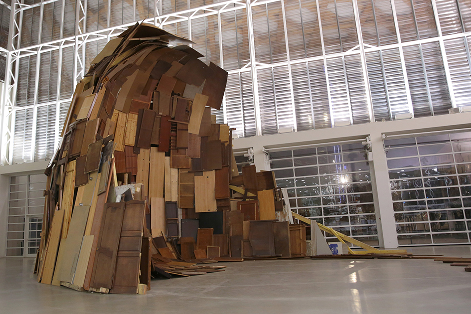
Morag Myerscough is hugely passionate about what she does. Full of energy and full pelt into conversation as soon as I arrive at her London studio – though she admits a couple of coffees were involved – this is mostly her decompressing from presenting to a client that morning. She is passionate about what she does – but what is that? The labels graphic designer, designer and artist have variously been applied, but Myerscough doesn’t care to be labelled. Her website has no bio, and she has no business cards – much to the shock, she says, of a cohort of students she met recently. If you look at her work for clues, one of her best-known projects is a much-photographed wall in London’s new Design Museum, but others include the Temple of Agape on London’s Southbank, a ‘Belonging Bandstand’ that moved around Sussex, bedrooms for the Sheffield children’s hospital, and the 2015 Stirling Prize-winning project of Burntwood School that she collaborated on with architects AHMM.

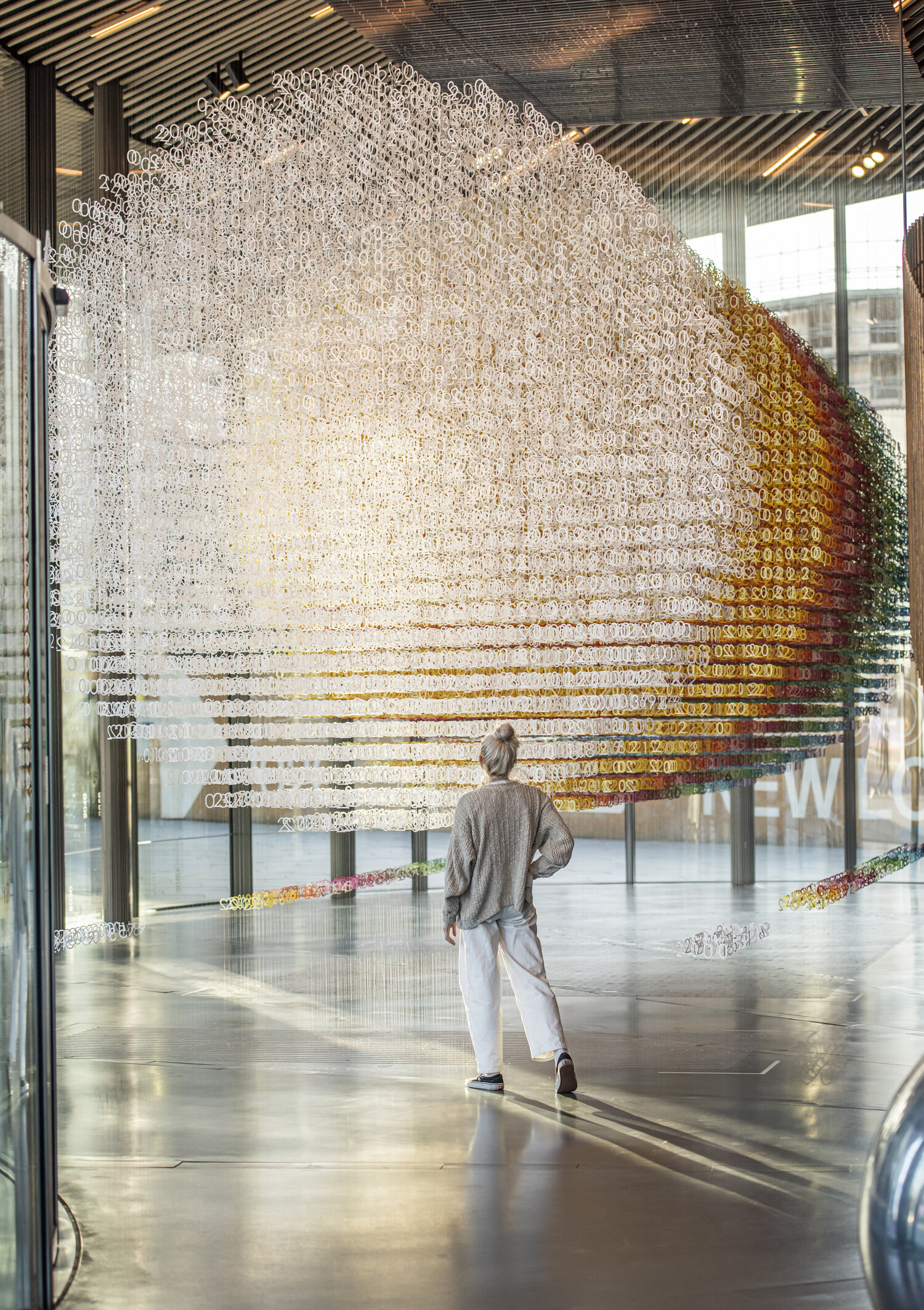
A project she has just presented was Mayfield in Manchester for developer U+I. Mayfield is a formerly derelict site in the process of being regenerated into a mixed-use development and public park. Myerscough’s large installation there displays the common traits in her work: it is a temporary, community-minded intervention in a public space, to be completed in a short deadline. Sceptics might see the combination of developer and artist as an exercise in ‘artwashing’, but there is a history of collaboration between her and Martyn Evans of U+I since a London community project, the Movement Cafe, completed in 2012. Myerscough is confident that what U+I is doing is positive, as ‘they do have a conscience’, and she is careful about who she works with, especially as she becomes better known and people approach her more and more. With developers, she says: ‘There’s always a level of moneymaking … but if you’re not displacing anyone or anything then I think it’s really important that places like Manchester get money put in them by different developers … because, obviously, if the European money gets taken away…’

Just as she has to trust the client, they have to trust her. If they do, she ‘will go beyond – far and beyond’. With this trust – and with age too, says Myerscough – comes a sense of freedom and confidence. She no longer feels like a designer fulfilling a brief for a brand, as she explains: ‘Now I’m doing Mayfield, I’m not really responding to it being the brand or whatever; I’m responding to the social environment and all the people.’ It’s a more personal response, ‘a different space where it comes more from me’.
Despite having plenty of experience, Myerscough always looks critically at what she does. She believes it is very important for more established designers to relate to younger generations. With personal growth it can too easily be forgotten that the world is changing too: she talks about the ‘old-school’ and ‘male’ situations still being created by certain, older architecture and design figures, while outside of the industry she laments former prime minister Theresa May being ‘so old-fashioned [as a woman], so wrong in every way’.

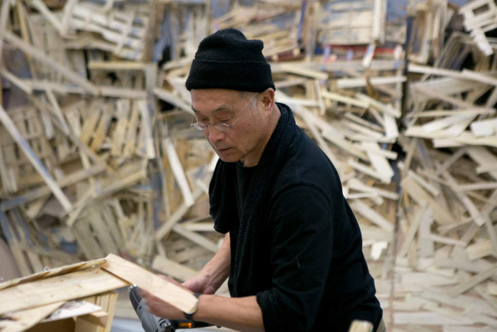
Although she frequently collaborates with artist Luke Morgan, Myerscough is a one-woman studio, which she set up in 1993. How she defines herself and her work is important, and she remembers the confidence and ease with which her male peers would start out on their own (Thomas Heatherwick launched his eponymous studio around the same time). Their ease, and her discomfort, was due to rather entrenched attitudes in the industry about gender. She regrets the name slightly – choosing Studio Myerscough rather than Morag Myerscough in order to appear bigger and more established – because she still meets people who are either unable or unwilling to make the connection between her achievements and the studio’s. However, Myerscough prefers remaining on her own even as the projects grow: being the whole of Studio Myerscough gives her freedom with her ideas, time and ambitions, and fewer financial considerations as she hasn’t employees to pay.

Looking back at Myerscough’s career, you see where the various labels came from. Prior to the studio she studied graphic design, although she has never felt this reflected her work. Professionally, she has been employed as a designer – for Lamb & Shirley post-graduation and then as head of the graphics team for Memphis Group member Michele de Lucci in Milan – before coming back to begin Studio Myerscough. Its first project was a competition for a giant hoarding, which she entered and won with AHMM, and although she never wanted to be an architect the two have worked together on other jobs to much acclaim beside Burntwood School, such as the 2008 Stirling Prize-shortlisted Westminster Academy at the Naim Dangoor Centre, and a new installation in London’s Broadgate development. She was appointed a Royal Designer for Industry, but if she were to describe herself it would be as an artist.

What do you see in Myerscough’s work? For the unfamiliar it is eye-catching: colourful, often large in scale and in the public realm. You can sense her artistic background: her mother was a textile artist, her father a musician, and her family has roots in the circus. She says her penchant for temporary installations is due to the memory of the childhood thrill she felt when the circus came to town – bright colours and gaudy excitement where there was nothing before.
People can be scared of her neons and loud hues, but she uses her experience with colour to challenge those fears. For Sheffield’s children’s hospital the staff initially balked at her multicoloured designs, preferring ‘calming blue and green’. But once ‘they realised we weren’t trying to kill the children’ the mocked-up bedroom designs went down very well with the patients, parents and staff – and, as it turns out, teenagers particularly love orange.

Sometimes you need to be shown things to understand: Myerscough talks about only realising some of her references for the Temple of Agape project upon walking through the erected structure (such as a temple she visited in India, where light entered beautifully through small openings in the walls).
Myerscough is interested in the difference between looking and seeing – one being passive, the other being active. This affects her approach to working with communities on public projects – considerable impact is made by how volunteers engage with the painting of the piece, able to see it after and say ‘I think I painted that bit’. On that same theme, a festival in Aberdeen called Look Again encouraged locals to reconsider a location in the city called Mercat Cross, which at that time was only frequented by drunks. The project had personal significance for Myerscough because Aberdeen was where her parents met and fell ‘in Love at First Sight’ – the name of the piece she produced for the festival. In among the brilliant team of women running the event, she felt her heritage more keenly than ever, seeing herself as she knew her mum – as a strong Scottish woman.
Myerscough may not like labels, but words are an important part of her work, often appearing large and readable from a distance. These words do not define but hope to provoke conversation. She often likes working with poets, and on Love at First Sight Jo Gilbert contributed with poetry in the local Doric dialect. Myerscough understands that people want to be recognised and appreciated for their unique knowledge and experience, but this can be a challenge for her original vision of a project. In Aberdeen the poem’s 300 words that needed painting were daunting, but Myerscough believes the point of collaboration isn’t to compromise.
Nor is it easy to work with large groups of volunteers rather than a dedicated, trained team, but the rewards are far more valuable, as volunteers treasure the experience. With every project Myerscough learns too – she tells me about how moved she was after a workshop with a blind school, as she never dreamed her work could reach beyond the visual in the way that it did, with the children making ‘incredible’ patterns with stickers and a grid.
At times during the interview I wish she would acknowledge the recognition that different groups want to give her – she inspires architects, designers, artists, nurses, patients, students and more, as their positive feedback testifies. Official accolades are rolling in too: a professorship at UCA Epsom, an honorary fellow at CSM, and a doctorate at Gloucester University, following one she received from Bournemouth, and on top of all this the appointment as a Royal Designer for Industry.
Open and enthusiastic, Myerscough’s heart is on her sleeve, but it is also on the painted surfaces of her work. She could be defined by her many labels and her many awards, but she is most confident in being defined by her work and the responses to it: colourful structures that light up spaces and the faces of those who visit them.
Words by Sophie Tolhurst