DELIMAR fabrics of the Meridian collection impress with their distinctive weave structures in refreshing summer colours and classic non-colours. Fresh white runs like a red thread through the collection. This results in exciting, creative combination possibilities beyond the individual colour worlds. When you look at the fabrics, you feel a little closer to the sun.
The Material
The fabrics of the Meridian collection are made of the innovative fibre Polyolefinic FR, whose positive properties are permanently anchored in the fibre. High lightfastness, resistance to chlorine and sea water and weather resistance are the characteristics of this special fibre. Of course, all DELIMAR articles are flame retardant. The fabrics can be machine washed at 40°C and dry quickly, so that mould and bacteria cannot grow. DELIMAR fabrics are free of harmful substances, antistatic and water-repellent.
We live in a time where nothing is new, and yet everything is new. We do new things in old ways and we use old technologies in new ways. We see trends that are new yet familiar. With the latest colour, design and material trends for 21/22, we encourage you to rethink, redo and remake to make your business fit for the future.
Extensive visual material and composed colour palettes, including exact colour values, allow you to apply the trends specifically to your own collection.- Heimtextil
Art is a voyage, a discovery of ones inner muse.To understand and believe in my own art, my own style I had to first understand me, believe in me and to believe and understand me I had to know my muse, the soul that I am.
And through this voyage and discovery of my muse, soul; every painting, design, story becomes a masterpiece of creation, a magickal gift- Walking the labyrinth- Nisha Desai
This video reminded me of an interesting project that was given to me to work on. A time when I moved from South Carolina to California back in 2003/2004 to start a new job. Young and filled with possibilities took a leap of faith and joined a high end designer in California to design his textile collection. He had an array of rich textiles from all over the world. It had been about 2 years since my graduation from Savannah College of Art and Design, very eager and excited to learn my way through the shades of textiles.
He had a screen printing facility in house. And back in time hand screen printing, making your own screens, huge printing tables were a big thing. Still maybe alive but not as much as it used to be back in the days. And my first assignment was to create 2 complete set of Pantone swatches with the screen printing pigment dyes on fabric. Kinda creating a fabric Pantone book/ binder for his library. Ha! Yup it was quite a task on hand. There were 2000 colors I had to create and print on a fabric and note the values of how I got that color. All I could think to myself is “what”? You want me to create these 2000 colors? My monkey mind got real busy with all kinds of stupid negative thoughts. But I was excited to be there and learn so I did not let my monkey mind override the truth. And the truth was I loved the opportunity given to me and if this is how it starts then so be it. Pulled myself together and got back on mixing colors. And it was a beautiful project. Easy, effortless and fun. In the beginning it was slow but as I started to understand the medium and the craft of making colors the task became fun, play and meditative.
Everyday from morning to evening for quite many months all I did was mix colors, until I reached a point to perfect the art of knowing colors and when and how much to add or subtract to get the desired shade or tint.
This practice, knowledge gave me insight into color and color making. The reason I share this as it has taught me a very valuable lesson. Lesson of being persistent and consistent, not to loose hope or to give up just because of what you think you should be doing or not doing in your mind. No job is small or big. No matter at that moment and time you don’t realize the value it is bringing you but hang on and walk through that project. You will be grateful for this task you were given to do. Every job/ task has a meaning, purpose. And it is given to you because only you could do it. And there is no one like you. Even though at first it looked like a huge task but if it wasn’t for this exercise I would have missed learning the importance of colors and it’s journey.
By the time I was done I did of course truly enjoyed the joy of colors. It was meditative, fun, soothing and healing for me. Every color has its own magickal presence, Vibration, vitality, strength and personality.
Matter of fact every task, job that I was given no matter how hard or easy the boss was or the task was it led me to connecting me to my trueself. My artist within. It is an opportunity for you to grow and know yourself within.
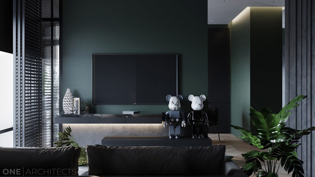
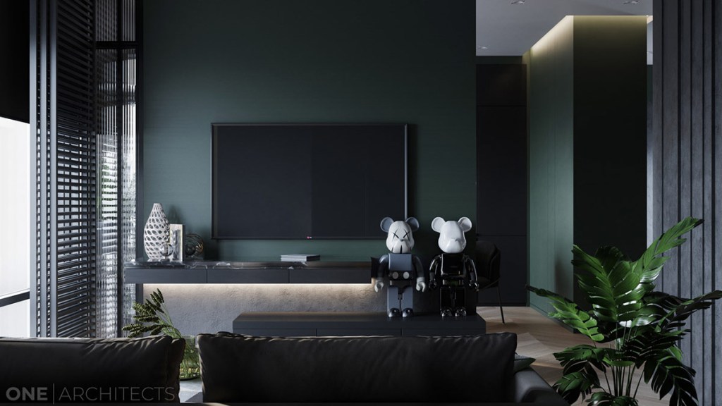
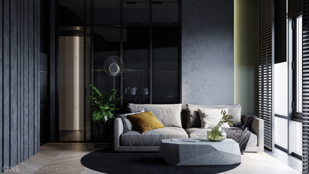
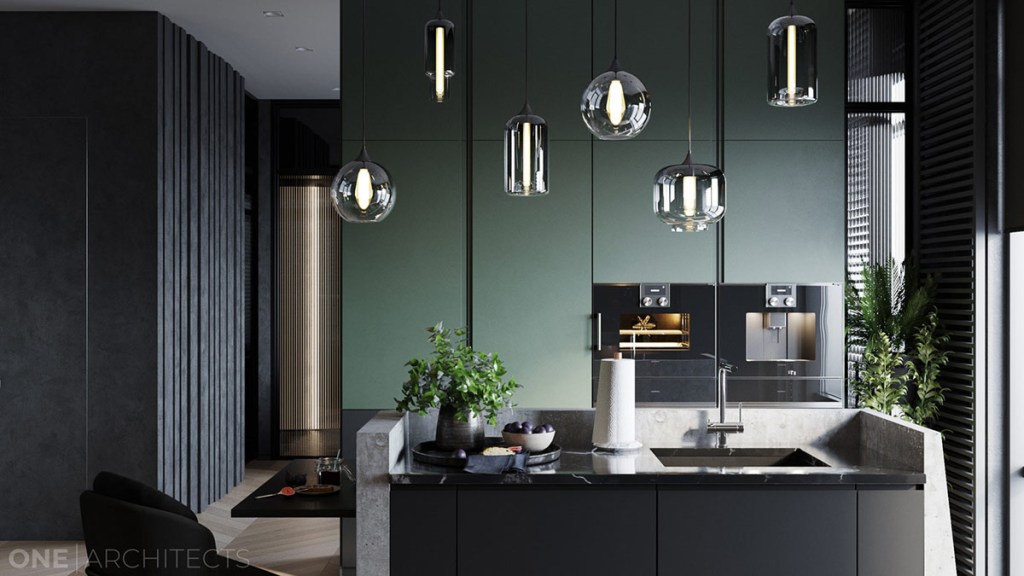
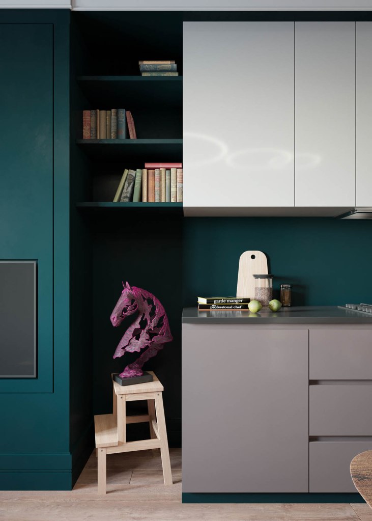
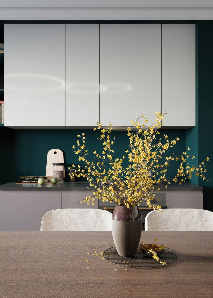
Dark green and handsome, these three home interiors each take a tall stand on style. The first two of our dreamy dark green interiors have an offbeat sort of edge. Hot pink accents burst onto the scene via outrageous wall art and unique art sculptures. Quirky personality particularly shines in the second of these, as a more colourful and patterned eclectic vibe builds. We finish up with a home more dedicated to the dark green scheme, with less distraction. Instead, we find luxe interludes of glossy white marble, and complete aesthetic cohesivity.
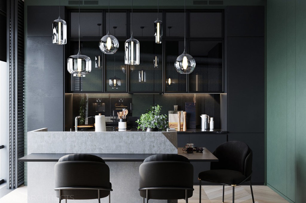
A pale grey cushiony sofa is given a pop of colour with an ochre accent cushion, which stands out brightly inside the shadowy room palette.The neon pink accent is repeated in other art pieces in the home, like this one in the green kitchen. The hot hue makes an electrifying addition to the dark green decor scheme.Differently shaped pendant shades make a glassy display above the dining island in the kitchen.Concrete siding wraps the central island. The concrete builds a short splash screen around the kitchen sink, which protects the diners seated low on the opposite side of it.A half-circle mirror opens up the end of the dark hallway. Chevron flooring points in the direction of the living room.The green bedroom is dominated by a black 4 poster bed with a simple draped canopy. Monochrome art and bedclothes deepen the scheme.
Sustainable fashion label Archivist is turning discarded luxury hotel bed linen and turning them into timeless shirts. The project, from Dutch designers Eugenie Haitsma and Johannes Offerhaus, started life when the pair acquired 200 kilos of Egyptian cotton bed linen from a luxury hotel in London’s Mayfair. The designers said: “We asked ourselves the question […]
DELIGARD upholstery fabrics: unrivaled in cleanliness and easy maintenance. Bacteria, dirt and moisture don’t stand a chance with this pattented innovative system. In hotels, restaurants, retirement homes and clinics textiles create an especially relaxing atmosphere by reducing noise and spreading warmth and comfort. DELIGARD upholstery fabrics have a singular anti-dirt protection; they thus offer protection against contermination which is of great importance in highly frequented public areas. They are the solution for long-lasting stainless upholstery.
Each individual fiber is enclosed by a protective sheath, replacing the commonly used “shallow” surface coating found in other fabrics. The special layer on the reverse side prevents the penetration of moisture and wetness. This innovative technology provides lasting protection against impurities and dirt, and is easy to clean.
Brooks DELIGARD expands this successful series of upholstery fabrics. It is characterised by its discreet graphic pattern and a soft touch. With this combination it not only offers a discreet and modern look, but also gives rooms a cosy atmosphere.
Here is an overview of the DELIGARD characteristics:
resistant to moisture and dirt
breathable
skin-friendly
prevents the growth of bacteria
hydrophobic
urine-resistant
disinfectant-resistant
extremely durable
environmentally friendly and pollutant-free
easy to upholster
particularly soft due to the textile reverse side
Flame-retardant properties: DIN EN 1021 Teil 1, DIN EN 1021 Teil 2, BS 5852 Crib 5, IMO Res. A652 (16)
Morag Myerscough is hugely passionate about what she does. Full of energy and full pelt into conversation as soon as I arrive at her London studio – though she admits a couple of coffees were involved – this is mostly her decompressing from presenting to a client that morning. She is passionate about what she does – but what is that? The labels graphic designer, designer and artist have variously been applied, but Myerscough doesn’t care to be labelled. Her website has no bio, and she has no business cards – much to the shock, she says, of a cohort of students she met recently. If you look at her work for clues, one of her best-known projects is a much-photographed wall in London’s new Design Museum, but others include the Temple of Agape on London’s Southbank, a ‘Belonging Bandstand’ that moved around Sussex, bedrooms for the Sheffield children’s hospital, and the 2015 Stirling Prize-winning project of Burntwood School that she collaborated on with architects AHMM.
The Temple of Agape. Image credit: Gareth Gardner
A project she has just presented was Mayfield in Manchester for developer U+I. Mayfield is a formerly derelict site in the process of being regenerated into a mixed-use development and public park. Myerscough’s large installation there displays the common traits in her work: it is a temporary, community-minded intervention in a public space, to be completed in a short deadline. Sceptics might see the combination of developer and artist as an exercise in ‘artwashing’, but there is a history of collaboration between her and Martyn Evans of U+I since a London community project, the Movement Cafe, completed in 2012. Myerscough is confident that what U+I is doing is positive, as ‘they do have a conscience’, and she is careful about who she works with, especially as she becomes better known and people approach her more and more. With developers, she says: ‘There’s always a level of moneymaking … but if you’re not displacing anyone or anything then I think it’s really important that places like Manchester get money put in them by different developers … because, obviously, if the European money gets taken away…’
There is a history of collaboration with U+I since a community project called the Movement Cafe. Image credit: Gareth Gardner
Just as she has to trust the client, they have to trust her. If they do, she ‘will go beyond – far and beyond’. With this trust – and with age too, says Myerscough – comes a sense of freedom and confidence. She no longer feels like a designer fulfilling a brief for a brand, as she explains: ‘Now I’m doing Mayfield, I’m not really responding to it being the brand or whatever; I’m responding to the social environment and all the people.’ It’s a more personal response, ‘a different space where it comes more from me’.
Despite having plenty of experience, Myerscough always looks critically at what she does. She believes it is very important for more established designers to relate to younger generations. With personal growth it can too easily be forgotten that the world is changing too: she talks about the ‘old-school’ and ‘male’ situations still being created by certain, older architecture and design figures, while outside of the industry she laments former prime minister Theresa May being ‘so old-fashioned [as a woman], so wrong in every way’.
One of the best-known projects is a much-photographed wall in London’s new Design Museum. Image credit: Gareth Gardner
Although she frequently collaborates with artist Luke Morgan, Myerscough is a one-woman studio, which she set up in 1993. How she defines herself and her work is important, and she remembers the confidence and ease with which her male peers would start out on their own (Thomas Heatherwick launched his eponymous studio around the same time). Their ease, and her discomfort, was due to rather entrenched attitudes in the industry about gender. She regrets the name slightly – choosing Studio Myerscough rather than Morag Myerscough in order to appear bigger and more established – because she still meets people who are either unable or unwilling to make the connection between her achievements and the studio’s. However, Myerscough prefers remaining on her own even as the projects grow: being the whole of Studio Myerscough gives her freedom with her ideas, time and ambitions, and fewer financial considerations as she hasn’t employees to pay.
Studio Myerscough. Image credit: Luke Morgan
Looking back at Myerscough’s career, you see where the various labels came from. Prior to the studio she studied graphic design, although she has never felt this reflected her work. Professionally, she has been employed as a designer – for Lamb & Shirley post-graduation and then as head of the graphics team for Memphis Group member Michele de Lucci in Milan – before coming back to begin Studio Myerscough. Its first project was a competition for a giant hoarding, which she entered and won with AHMM, and although she never wanted to be an architect the two have worked together on other jobs to much acclaim beside Burntwood School, such as the 2008 Stirling Prize-shortlisted Westminster Academy at the Naim Dangoor Centre, and a new installation in London’s Broadgate development. She was appointed a Royal Designer for Industry, but if she were to describe herself it would be as an artist.
The Belonging Bandstand in Brighton. Image credit: Morag Myerscough
What do you see in Myerscough’s work? For the unfamiliar it is eye-catching: colourful, often large in scale and in the public realm. You can sense her artistic background: her mother was a textile artist, her father a musician, and her family has roots in the circus. She says her penchant for temporary installations is due to the memory of the childhood thrill she felt when the circus came to town – bright colours and gaudy excitement where there was nothing before.
People can be scared of her neons and loud hues, but she uses her experience with colour to challenge those fears. For Sheffield’s children’s hospital the staff initially balked at her multicoloured designs, preferring ‘calming blue and green’. But once ‘they realised we weren’t trying to kill the children’ the mocked-up bedroom designs went down very well with the patients, parents and staff – and, as it turns out, teenagers particularly love orange.
For Sheffield’s children’s hospital the staff initially balked at the multicoloured designs. Image credit: Jill Tate
Sometimes you need to be shown things to understand: Myerscough talks about only realising some of her references for the Temple of Agape project upon walking through the erected structure (such as a temple she visited in India, where light entered beautifully through small openings in the walls).
Myerscough is interested in the difference between looking and seeing – one being passive, the other being active. This affects her approach to working with communities on public projects – considerable impact is made by how volunteers engage with the painting of the piece, able to see it after and say ‘I think I painted that bit’. On that same theme, a festival in Aberdeen called Look Again encouraged locals to reconsider a location in the city called Mercat Cross, which at that time was only frequented by drunks. The project had personal significance for Myerscough because Aberdeen was where her parents met and fell ‘in Love at First Sight’ – the name of the piece she produced for the festival. In among the brilliant team of women running the event, she felt her heritage more keenly than ever, seeing herself as she knew her mum – as a strong Scottish woman.
Myerscough may not like labels, but words are an important part of her work, often appearing large and readable from a distance. These words do not define but hope to provoke conversation. She often likes working with poets, and on Love at First Sight Jo Gilbert contributed with poetry in the local Doric dialect. Myerscough understands that people want to be recognised and appreciated for their unique knowledge and experience, but this can be a challenge for her original vision of a project. In Aberdeen the poem’s 300 words that needed painting were daunting, but Myerscough believes the point of collaboration isn’t to compromise.
Nor is it easy to work with large groups of volunteers rather than a dedicated, trained team, but the rewards are far more valuable, as volunteers treasure the experience. With every project Myerscough learns too – she tells me about how moved she was after a workshop with a blind school, as she never dreamed her work could reach beyond the visual in the way that it did, with the children making ‘incredible’ patterns with stickers and a grid.
At times during the interview I wish she would acknowledge the recognition that different groups want to give her – she inspires architects, designers, artists, nurses, patients, students and more, as their positive feedback testifies. Official accolades are rolling in too: a professorship at UCA Epsom, an honorary fellow at CSM, and a doctorate at Gloucester University, following one she received from Bournemouth, and on top of all this the appointment as a Royal Designer for Industry.
Open and enthusiastic, Myerscough’s heart is on her sleeve, but it is also on the painted surfaces of her work. She could be defined by her many labels and her many awards, but she is most confident in being defined by her work and the responses to it: colourful structures that light up spaces and the faces of those who visit them.
Antibacterial fabrics & Fabrics suitable for hygienic washing
These furnishing fabrics are perfectly suited to the high requirements of the health care sector, both in quality and in function. They are hygienically washable at 72°C They are permanently flame retardant. They offer typical colour concepts for a hospital they are easy-care, crease-resistant and stable they protect against sunlight and offer privacy they offer a great selection of qualities and colours.
DELICARE – anti-microbial furnishing fabrics prevents the growth of bacteria (hospital bugs, staphylococcus aureus which cause MRSA)reduce odours caused by microbes are conducive to a better hygienic standard in rooms are suitable for industrial washing have a long lasting wash resistance conserve energy due to longer washing intervals and a lower washing temperature are certified by the Fraunhofer Institute Are JIS 1902 certified.