33 Photos Of Weird & Rare Flowers That Look Like Something From A Fairytale- Nisha Designs

I was really intrigued when I saw a monkey orchid in Singapore orchid gardens. Believe me, it was looking exactly like a monkey. I got really inspired after seeing that weird flower and thought of doing a research on various weird looking flowers. I got a huge collection of rare and mysterious pictures of orchids and other flowers.

If you are a nature enthusiast, you will really enjoy this collection of flowers. This collection includes various rare orchids, tulips etc. Some of these flowers can be grown in your small garden and it can be a decor  for your home.

Lets take a look at 33 of these amazing collection of rare and mysterious flowers: Here u get 30 exotic and colourful garden flowers.

1. Monkey Orchid

Scientific Name : Dracula saulii

Monkey Orchid

2. Hooker’s Lips

Scientific Name : Psychotria elata

The bright red color of this flower attracts pollinators like humming bird. Commonly found in the rain forests of Central and South America. The flower looks like a pair of lips in its budding stage before fully blooming into a flower.

Hooker’s Lips

3. Naked Man Orchid

Scientific Name : Orchis italica

Commonly found in the Mediterranean. The lip of this orchid looks just like a man and hence called Naked man orchid.

Naked Man Orchid

4. Ice cream tulip

Scientific Name : Tulipa icecream

This flower definitely lives up to its name and looks exactly like a delicious ice cream cone. White petals are closely mounted against one another and form a central cone. Its visual appeal makes it a center-piece in any garden.

ice cream tulip

5. Moth Orchid

Scientific Name : Phalaenopsis

This is the most common orchid variety due to its ease of production and the availability of blooming plants all year-round. Found in Southeast Asia, New Guinea, Southern China, the Indian Subcontinent and Queensland.

Moth Orchid

6. Dancing Girls

Scientific Name : Impatiens bequaertii

Commonly found in the rain forests of East Africa. This flower is very small, about half inch in length.

Dancing Girls

7. Laughing Bumble Bee Orchid

Scientific Name : Ophrys bombyliflora

Comes under bee orchid species. This plant is a native of the Mediterranean region. It’s named after the Greek word bombylios, meaning bumble bee.

Laughing Bumble Bee Orchid

8. Swaddled Babies

Scientific Name : Anguloa uniflora

The flowers of this orchid resembles babies sleeping in a cradle. Commonly found in parts of South America.

Swaddled Babies

9. Parrot Flower

Parrot Flower

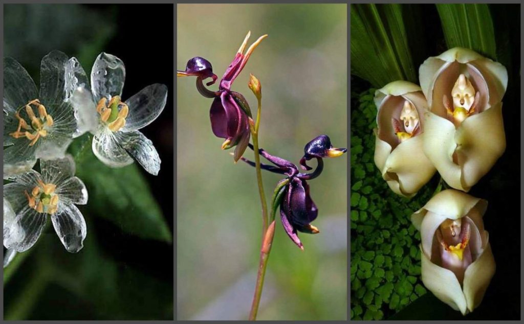
10. Flying Duck Orchid

Scientific Name : Caleana major

This bright colored flower is a native of Australia. The bright purple color attracts pollinating agents.

Flying Duck Orchid

11. Tiger faced orchid

The center portion of this orchid flower looks exactly like the face of a tiger, as evident from the image below.

Tiger faced orchid

12. Happy Alien

Scientific Name : Calceolaria uniflora

This mountain plant is commonly found in the southern part of South America. Its combination of red, white and yellow colors makes it look like an alien.

Happy Alien

13. Angel Orchid

Scientific Name : Habenaria grandifloriformis

This flower is white in color and the arrangement of petals makes it look like an angel. Commonly found in the grasslands of Southern India.

Angel Orchid

14. Dove Orchid

Scientific Name : Peristeria elata

A Native of Central America, the central portion of this white flower resembles a dove. Also called Holy Ghost Orchid.

Dove Orchid

15. Ballerina Orchid

Scientific Name : Caladenia melanema

This orchid exactly looks like a ballerina dancer. Commonly found in Australia.

Ballerina orchid

16. White Egret Orchid

Scientific Name : Habenaria radiata

This orchid flower looks like a white egret in flight. Found in China, Japan, Korea and Russia.

White Egret Orchid

17. Jewel Orchid

Scientific Name : Anoectochilus geniculatus

These are so named because of the stunning patterns and coloration of their dramatic foliage.

Jewel Orchid

18. Darth Vader Flower

Scientific Name : Aristolochia salvadorensis

This flower looks like the mask of popular Star Wars character Darth Vader and hence the name.

Darth Vader flower

19. Grey Spider Flower

Scientific Name : Grevillea buxifolia

This flower has yellowish and white petals, with stalks covered in reddish brown hairs. The arrangement makes it look like a grey spider. Commonly found in New South Wales in Australia.

Grey Spider Flower

image source here

20. Sara Tree Flower

Scientific Name : Couroupita guianensis

Also known as Cannonball Tree Flower, this is a native to the rain forests of Central and South America.

Sara Tree Flower

21. Mirror Orchid

Scientific Name : Ophrys speculum

This petals of this unique orchid resembles a female wasp. Male wasps, thinking that the petals are a female, land on them and helps in pollination.

Mirror Orchid

22. Pink Lady’s Slipper Orchid

Scientific Name : Cypripedium acaule

This flower is commonly found in Canada. The petals are yellowish-brown to maroon in color with a large pouch that is usually a shade of pink. The pouch is prominent and gives this flower a lady’s slipper like look.

Pink Lady’s Slipper Orchid

23. Lily-of-the-Valley Flower

Scientific Name : Convallaria majalis

Lily of the valley plants are one of the most fragrant and blooming plants in the spring and early summer throughout the northern temperate zone.

Lily-of-the-valley flower

24. Bird of Paradise

Scientific Name : Strelitzia reginae

Also called Crane flower. This flower is a native of South Africa.

Bird of Paradise

25. Passiflora Violacea Victoria

This flower is purple in color with a dark center and white filament tips.

Passiflora Violacea Victoria

26. Paracaleana Nigrita

This flower resembles a bird in flight. Its a native of Australia.

Paracaleana nigrita

27. Fly Orchid

Scientific Name : Ophrys insectifera

This orchid flower looks just like a fly and so it is called fly orchid. Commonly found in Europe.

Fly Orchid

image source here

28. Skeleton Flower

Scientific Name : Diphylleia grayi

This flower is called skeleton flower because its petals turn crystal clear when they make contact with water. When dry, the flower is white in color!!!

Skeleton flower

29. The Bat Flower

Scientific Name : Tacca Chantrieri

This flower is native to tropical regions of Southeast Asia including Thailand, Malaysia, and southern China. This flower is also called Devil’s flower, thanks to its devil like appearance.

The bat flower

30. Ceropegia

Scientific Name : Ceropegia Haygarthii

The name of this flower was derived from the words ‘keros’ meaning wax and ‘pege’ meaning fountain. As the name suggests, this flower looks like a fountain of wax. Also called parachute flower or lantern flower. Commonly found in Africa, southern Asia and Australia.

Ceropegia Haygarthii

31. Jungle Night Flower

Scientific Name : Amorphophallus paeoniifolius

This is the flower of elephant foot yam or stink lily, which is a tropical tuber crop grown in Africa, South Asia and Southeast Asia.

Jungle Night Flower

32. Flame Lily

Scientific Name : Gloriosa superba

This flower, with its spectacular array of yellow and red colored petals, looks like a flame. Also known by the name fire lily. Commonly found in Asia and Africa.

Flame Lily

33. Jeweled Carpet Flower

The arrangement of petals gives this flower a jewel – like appearance and hence called so.

Jeweled Carpet FlowerSource: Small Garden Ideas

Via: https://moon-child.net/33-photos-of-weird-rare-flowers-that-look-like-someting-from-a-fairytale/

Dark Green And Handsome Home Interiors- Nisha Designs

Dark green and handsome, these three home interiors each take a tall stand on style. The first two of our dreamy dark green interiors have an offbeat sort of edge. Hot pink accents burst onto the scene via outrageous wall art and unique art sculptures. Quirky personality particularly shines in the second of these, as a more colourful and patterned eclectic vibe builds. We finish up with a home more dedicated to the dark green scheme, with less distraction. Instead, we find luxe interludes of glossy white marble, and complete aesthetic cohesivity.

A pale grey cushiony sofa is given a pop of colour with an ochre accent cushion, which stands out brightly inside the shadowy room palette.
The neon pink accent is repeated in other art pieces in the home, like this one in the green kitchen. The hot hue makes an electrifying addition to the dark green decor scheme.
Differently shaped pendant shades make a glassy display above the dining island in the kitchen.
Concrete siding wraps the central island. The concrete builds a short splash screen around the kitchen sink, which protects the diners seated low on the opposite side of it.
A half-circle mirror opens up the end of the dark hallway. Chevron flooring points in the direction of the living room.
The green bedroom is dominated by a black 4 poster bed with a simple draped canopy. Monochrome art and bedclothes deepen the scheme.

VIA: http://www.home-designing.com/dark-green-and-handsome-home-interiors

The compass of a world called Intuition- A synthesis of Design, Tarot and Gestalt Psychology. Created byMatteo di PascaleIntùiti- Nisha Designs

Intùiti is a pack of 78 cards that really helps you dive into your deepest creative process.

It was born as a project of the Polytechnic University of Milan and it represents a new way of living the subject of creativity, an issue that is often superficially tackled. Instead of forcing the user to find an idea, as it happens with some techniques like brainstorming or the mind map, Intùiti invites to sit calmly and to feel what one has to give, remembering that creating must be a source of joy and satisfaction. 

Intùiti proposes pointed suggestions, obtained from the analysis of classic tarots, that are a rich collection of archetypes. It has no divination purpose: each card is related to a thinking model that belongs to our culture, a powerful incentive that can put in motion creative and inspirational processes.

Intùiti is a synthesis of Design, Tarots, Numerology and Gestalt Psychology. It is both a serious game and a powerful tool that brings out the brightest side of creativity without employing rigid schemes.

Visual incentives and Tales

In the pack you will find two series of pictures: the primary intùitiand the secondary intùiti. The first ones are extensive inspirations; the second ones are more specific. To each picture corresponds an evocative tale that intensifies its sensation.

Each card represents a powerful incentive and is designed using Gestalt principles so you can recognize emotionally the related archetype.

You can play as you see fit. There are no main rules. It’s a tool for creative thinking based on visual and imaginary associations, so you just have to shuffle the deck, pick a card, and “let it speak”.

Give it a look: these cards are truly gorgeous!

Backstage

It took over one year of study and development and then other 6 months for enhancement. All the drawings are handmade and later digitalized for the industrial production.

Foto di Attilio Marasco

Intùiti is not an answer!

People often want to find the solution to their “creative problems” in a tool or in method; they would like to have an equation, an algorithm able to solve the real issue of Creativity: to create something new. But using a “recipe” for writing a novel means to have produced something, not to have invented something.

It’s important to reiterate: Intùiti is not an algorithmic function that can “make people creative”, or a scientific method able to produce thousands of brilliant ideas. It’s an inspirational tool: it’s not an answer, but a continuos question.

Via: https://intuiti.it

BELTANE BLESSING 2020-History- May Day- Nisha Designs-Ravenhawksmagazine

The word Beltane corresponds to the modern Irish Gaelic word Bealtaine, the name of the month of May, and to the Scottish Gaelic word Bealtuinn meaning May Day.
Other names For the Day and the celebrations are:
May 1: Rudemas/Roodmas, Rood Day (the Christian term for Rood Day), St. Walburga’s Day; Beltane, May Day, Cetsamhain (opposite Samhain), Cershamain, Fairy Day, Sacred Thorn Day, Old Beltane, Beltaine, Beltain, Baltane, Walpurgis Night, Floriala (Roman feast of flowers from April 29 to May 1), Walpurgisnacht (Germanic-feast of St. Walpurga), Thrimilce (Anglo-Saxon), Bloumaand (Old Dutch) This holiday like many of the sabbats start on the eve and is celebrated thru the following Day.
There is no consensus on how the name was derived at but it is agreed that this Sabbat honors fertility and creation.
This was also a time when many cultures light Balefires. In some places that is still an honored tradition.

Beltane is mentioned in some of the earliest Irish literature, and it is associated with important events in Irish mythology. It marked the beginning of summer and was when cattle were driven out to the summer pastures. Rituals were performed to protect the cattle, crops, and people, and to encourage growth.

Native Visions — Graffiti Lux Art & More — Life & Soul Magazine

Found this in a small underpass. The colours are gorgeous. Here’s the east side. It is very different from any other native street art I have found. There are a lot of faces on the west side. The faces are in organic things, like tree trunks. I have turtle love. Pics taken by Resa – […] […]

Native Visions — Graffiti Lux Art & More — Life & Soul Magazine

Upholstery fabric with purity technology- Nisha Designs

DELIGARD upholstery fabrics: unrivaled in cleanliness and easy maintenance. Bacteria, dirt and moisture don’t stand a chance with this pattented innovative system. In hotels, restaurants, retirement homes and clinics textiles create an especially relaxing atmosphere by reducing noise and spreading warmth and comfort. DELIGARD upholstery fabrics have a singular anti-dirt protection; they thus offer protection against contermination which is of great importance in highly frequented public areas. They are the solution for long-lasting stainless upholstery.

Each individual fiber is enclosed by a protective sheath, replacing the commonly used “shallow” surface coating found in other fabrics. The special layer on the reverse side prevents the penetration of moisture and wetness. This innovative technology provides lasting protection against impurities and dirt, and is easy to clean.

Brooks DELIGARD expands this successful series of upholstery fabrics. It is characterised by its discreet graphic pattern and a soft touch. With this combination it not only offers a discreet and modern look, but also gives rooms a cosy atmosphere.

Here is an overview of the DELIGARD characteristics: 

  • resistant to moisture and dirt
  • breathable
  • skin-friendly
  • prevents the growth of bacteria
  • hydrophobic
  • urine-resistant
  • disinfectant-resistant
  • extremely durable
  • environmentally friendly and pollutant-free
  • easy to upholster
  • particularly soft due to the textile reverse side
  • Flame-retardant properties: DIN EN 1021 Teil 1, DIN EN 1021 Teil 2, BS 5852 Crib 5, IMO Res. A652 (16)
  • Martindale: 30,000 Tours

Brooks Fabrics: https://www.delius-contract.de/en/products/contract-fabrics/brooks

Do you need samples or advice? Then send an e-mail to nisha@nishadesigns.com or call us at 702.622.8321

Happy Earth Day- Earth Dragon- Nisha Designs

Walking the path of earth is living in harmony with nature in everything we do. The word nature literally means “that which is born.” When the poet e.e. cummings spoke of the difference between “a world of made” and “a world of born” in one of his most famous poems, he gave voice to trust in nature— recognize that the natural world is our home, our source, and the teacher of the wisdom we most need to learn- Philip Carr- Gomm

The Celtic symbol of the dragon is magical, one of transformation and eternal wisdom. The druids respected dragons as forces of nature, the guardians of mother earth and all things sacred, the protectors of nature and all living things. The dragon holds the powerful Celtic symbol of protection and power. These magical beings represented all that the universe has to offer.

Dragon energy was worshiped and used for the greater good. At special celebrations of the turning seasons of the year, to harvest the right crops, as a true guardian for all they held sacred.

The earth dragon has a symbolism of nature and all things connected to our Mother Earth. The earth dragon asks us to connect with nature in all of its beauty. The true wealth is not money but from the beauty of our land.

Call on the energy of the earth dragon if your energy needs grounding, or if you have lost your way a little, she will reconnect you to true source and bring back your power.

Morag Myerscough- her work brightens up space wherever it goes- Nisha Designs

Morag Myerscough is hugely passionate about what she does. Full of energy and full pelt into conversation as soon as I arrive at her London studio – though she admits a couple of coffees were involved – this is mostly her decompressing from presenting to a client that morning. She is passionate about what she does – but what is that? The labels graphic designer, designer and artist have variously been applied, but Myerscough doesn’t care to be labelled. Her website has no bio, and she has no business cards – much to the shock, she says, of a cohort of students she met recently. If you look at her work for clues, one of her best-known projects is a much-photographed wall in London’s new Design Museum, but others include the Temple of Agape on London’s Southbank, a ‘Belonging Bandstand’ that moved around Sussex, bedrooms for the Sheffield children’s hospital, and the 2015 Stirling Prize-winning project of Burntwood School that she collaborated on with architects AHMM.

The Temple of Agape. Image credit: Gareth Gardner

A project she has just presented was Mayfield in Manchester for developer U+I. Mayfield is a formerly derelict site in the process of being regenerated into a mixed-use development and public park. Myerscough’s large installation there displays the common traits in her work: it is a temporary, community-minded intervention in a public space, to be completed in a short deadline. Sceptics might see the combination of developer and artist as an exercise in ‘artwashing’, but there is a history of collaboration between her and Martyn Evans of U+I since a London community project, the Movement Cafe, completed in 2012. Myerscough is confident that what U+I is doing is positive, as ‘they do have a conscience’, and she is careful about who she works with, especially as she becomes better known and people approach her more and more. With developers, she says: ‘There’s always a level of moneymaking … but if you’re not displacing anyone or anything then I think it’s really important that places like Manchester get money put in them by different developers … because, obviously, if the European money gets taken away…’

There is a history of collaboration with U+I since a community project called the Movement Cafe. Image credit: Gareth Gardner

Just as she has to trust the client, they have to trust her. If they do, she ‘will go beyond – far and beyond’. With this trust – and with age too, says Myerscough – comes a sense of freedom and confidence. She no longer feels like a designer fulfilling a brief for a brand, as she explains: ‘Now I’m doing Mayfield, I’m not really responding to it being the brand or whatever; I’m responding to the social environment and all the people.’ It’s a more personal response, ‘a different space where it comes more from me’.

Despite having plenty of experience, Myerscough always looks critically at what she does. She believes it is very important for more established designers to relate to younger generations. With personal growth it can too easily be forgotten that the world is changing too: she talks about the ‘old-school’ and ‘male’ situations still being created by certain, older architecture and design figures, while outside of the industry she laments former prime minister Theresa May being ‘so old-fashioned [as a woman], so wrong in every way’.

One of the best-known projects is a much-photographed wall in London’s new Design Museum. Image credit: Gareth Gardner

Although she frequently collaborates with artist Luke Morgan, Myerscough is a one-woman studio, which she set up in 1993. How she defines herself and her work is important, and she remembers the confidence and ease with which her male peers would start out on their own (Thomas Heatherwick launched his eponymous studio around the same time). Their ease, and her discomfort, was due to rather entrenched attitudes in the industry about gender. She regrets the name slightly – choosing Studio Myerscough rather than Morag Myerscough in order to appear bigger and more established – because she still meets people who are either unable or unwilling to make the connection between her achievements and the studio’s. However, Myerscough prefers remaining on her own even as the projects grow: being the whole of Studio Myerscough gives her freedom with her ideas, time and ambitions, and fewer financial considerations as she hasn’t employees to pay.

Studio Myerscough. Image credit: Luke Morgan

Looking back at Myerscough’s career, you see where the various labels came from. Prior to the studio she studied graphic design, although she has never felt this reflected her work. Professionally, she has been employed as a designer – for Lamb & Shirley post-graduation and then as head of the graphics team for Memphis Group member Michele de Lucci in Milan – before coming back to begin Studio Myerscough. Its first project was a competition for a giant hoarding, which she entered and won with AHMM, and although she never wanted to be an architect the two have worked together on other jobs to much acclaim beside Burntwood School, such as the 2008 Stirling Prize-shortlisted Westminster Academy at the Naim Dangoor Centre, and a new installation in London’s Broadgate development. She was appointed a Royal Designer for Industry, but if she were to describe herself it would be as an artist.

The Belonging Bandstand in Brighton. Image credit: Morag Myerscough

What do you see in Myerscough’s work? For the unfamiliar it is eye-catching: colourful, often large in scale and in the public realm. You can sense her artistic background: her mother was a textile artist, her father a musician, and her family has roots in the circus. She says her penchant for temporary installations is due to the memory of the childhood thrill she felt when the circus came to town – bright colours and gaudy excitement where there was nothing before.

People can be scared of her neons and loud hues, but she uses her experience with colour to challenge those fears. For Sheffield’s children’s hospital the staff initially balked at her multicoloured designs, preferring ‘calming blue and green’. But once ‘they realised we weren’t trying to kill the children’ the mocked-up bedroom designs went down very well with the patients, parents and staff – and, as it turns out, teenagers particularly love orange.

For Sheffield’s children’s hospital the staff initially balked at the multicoloured designs. Image credit: Jill Tate

Sometimes you need to be shown things to understand: Myerscough talks about only realising some of her references for the Temple of Agape project upon walking through the erected structure (such as a temple she visited in India, where light entered beautifully through small openings in the walls).

Myerscough is interested in the difference between looking and seeing – one being passive, the other being active. This affects her approach to working with communities on public projects – considerable impact is made by how volunteers engage with the painting of the piece, able to see it after and say ‘I think I painted that bit’. On that same theme, a festival in Aberdeen called Look Again encouraged locals to reconsider a location in the city called Mercat Cross, which at that time was only frequented by drunks. The project had personal significance for Myerscough because Aberdeen was where her parents met and fell ‘in Love at First Sight’ – the name of the piece she produced for the festival. In among the brilliant team of women running the event, she felt her heritage more keenly than ever, seeing herself as she knew her mum – as a strong Scottish woman.

Myerscough may not like labels, but words are an important part of her work, often appearing large and readable from a distance. These words do not define but hope to provoke conversation. She often likes working with poets, and on Love at First Sight Jo Gilbert contributed with poetry in the local Doric dialect. Myerscough understands that people want to be recognised and appreciated for their unique knowledge and experience, but this can be a challenge for her original vision of a project. In Aberdeen the poem’s 300 words that needed painting were daunting, but Myerscough believes the point of collaboration isn’t to compromise.

Nor is it easy to work with large groups of volunteers rather than a dedicated, trained team, but the rewards are far more valuable, as volunteers treasure the experience. With every project Myerscough learns too – she tells me about how moved she was after a workshop with a blind school, as she never dreamed her work could reach beyond the visual in the way that it did, with the children making ‘incredible’ patterns with stickers and a grid.

At times during the interview I wish she would acknowledge the recognition that different groups want to give her – she inspires architects, designers, artists, nurses, patients, students and more, as their positive feedback testifies. Official accolades are rolling in too: a professorship at UCA Epsom, an honorary fellow at CSM, and a doctorate at Gloucester University, following one she received from Bournemouth, and on top of all this the appointment as a Royal Designer for Industry.

Open and enthusiastic, Myerscough’s heart is on her sleeve, but it is also on the painted surfaces of her work. She could be defined by her many labels and her many awards, but she is most confident in being defined by her work and the responses to it: colourful structures that light up spaces and the faces of those who visit them.

studiomyerscough.com

Words by Sophie Tolhurst

Tadashi Kawamata’s Monumental Wooden Artworks- Nisha Designs

Chaises ©Leo van der Kleij

Tadashi Kawamata is a man with a material, wood. With this he builds cabins, observatories, nests and monumental frescos that are at home both in galleries and in the heart of towns and cities. While you might think that the artist, educated at the Tokyo University of the Arts, would use only high quality woods, the reality is rather different. Kawamata instead uses recycled wood from furniture from junk shops, old crates and other left over materials. These recycled materials have been elevated by art, both make for beautiful creative objects, and have a low environmental impact. 

The artist works between Paris and Tokyo and began attracting global attention in the 1970s with his in situ works entitled By Land. He installed wood cabins in the most inaccessible parts of New York and Tokyo, such as Madison Square. A few years later he created Les chaises de traverse, a huge pile of wooden chairs suspended between the floor and the ceiling in the Delme synagogue. A few miles the artist also filled the Saint-Livier Hotel in Metz with a wall of chairs. In a short film by Gilles Coudert, the artist explains how each of the chairs represents a different person with a different history, and the wall is as if each of these people were linked together. In 2010 the artist scaled up, setting up a cabin in front of the Centre Pompidou before his chef d’oeuvre at the Renaissance Palazzo Strozzi in Florence. 

Engaged artworks

Tadashi Kawamata, Wave, 2016 Installation in situ. Éléments de mobilier en bois récupérés. Vue d’exposition “Tadashi Kawamata. Under the Water – Metz”, Centre Pompidou-Metz, 2016 © Tadashi Kawamata © Centre Pompidou-Metz / Photo Noémie Gotti

Tadashi Kawamata, Wave, 2016 Installation in situ. Éléments de mobilier en bois récupérés. Vue d’exposition “Tadashi Kawamata. Under the Water – Metz”, Centre Pompidou-Metz, 2016 © Tadashi Kawamata © Centre Pompidou-Metz / Photo Noémie Gotti

In 2011 the work of Kawamata took on a new dimension following the tsunami that hit Japan. In Tokyo during the earthquake, he soon left for Paris, while people at home were on the front line helping one another, the artist wondered how he could maintain a link with them. He soon made one of his most emblematic works Under the Water a huge wooden wave recreating the tsunami that ravaged the Japanese coastlines. The work was exhibited at the Centre Pompidou Metz and at the gallery Kamel Mennour where the artist often shows.

Some would like to categorise it as an activist project, but Kawamata firmly rejects the appellation, I’m not an activist, he says, preferring instead to think about the political and social aspects of an issue in a different way. His work would be better described as Land Art, a name given to him when he was appointed the Ordre des Arts et des Lettres in 2014. The contemporary art movement however also uses natural materials but is more oriented towards work that uses nature as its canvas, whereas Kawamata is more at home in the urban or public spaces. 

Ephemeral artworks

Tadashi Kawamata Under the Water Metz 2016 Installation in situ. Eléments de mobilier en bois récupérés. Vue d’exposition Tadashi Kawamata. Under the Water Metz, Centre Pompidou-Metz 2016 © Tadashi Kawamata © Centre Pompidou-Metz Photo Noémie Gotti

Tadashi Kawamata Under the Water Metz 2016 Installation in situ. Eléments de mobilier en bois récupérés. Vue d’exposition Tadashi Kawamata. Under the Water Metz, Centre Pompidou-Metz 2016 © Tadashi Kawamata © Centre Pompidou-Metz Photo Noémie Gotti

The work of Tadashi Kawamata is marked by its ephemeral nature. His monumental wooden creations both infiltrate and accompany buildings, but are easily dismounted and given a new artistic life.

Nothing is recurring, nothing is permanent states the artist. No material can survive for eternity, everything is temporary. It is just a question of time, even a building that lasts 1000 years is temporary. Nothing is resistant to the wear of time, not men, not walls. 

Destruction n°32 ©Archives kamel mennour
Destruction n°20 ©Archives kamel mennour
©Photo archives kamel mennour

Via: https://pen-online.com/arts/tadashi-kawamatas-monumental-wooden-artworks/?scrolled=1

Buaisou, Indigo Dyes from Leaves to Jeans- Nisha Designs

©Kyoko Nishimoto/BUAISOU

While indigo dye has been produced since the 19th century in Japan, it was only in the early 20th century that it became widespread. It took off most prominently in Tokushima, 600 kilometres from Tokyo on the island of Shikoku. At the time, there were almost 2000 cultivators, today there remain only five. Among them are the craftsperson collective Buaisou, whose mission is to preserve the ancestral art of indigo blue dye.

Buaisou was created in 2015 by Kakuo Kaji who responded to an open call from the Japanese Ministry for Education, offering to train up to two people in the craft of indigo dye. The aim was to preserve this art form before it was lost forever. Buaisou was born, establishing itself as a collective of farmers and dyers who follow through the whole process from start to finish.

‘At Buaisou, we are involved in every step”, says Kaji. “From planting the indigo seeds to producing the dyes and to dyeing the fabric’.

Indigo, the unique art, rooted in Japanese culture

©Kyoko Nishimoto/BUAISOU

The founder explains how he became interested in indigo dye at the age of 17 years old. ‘I moved from Aomori to Tokyo to study textile design at Zokei University. This is when I first became interested in indigo dyeing. I fell in love with the process and the patience it requires – it is unique compared to other forms of plant dyeing in that it takes significantly more time. It is an art form.’ 

Today, Buaisou is run by six people. Five craftsmen who are responsible for farming and dyeing, and Kaji, the director of the team. ‘We wanted to create the colour all by ourselves’, he explains. ‘Everything is done on-site at our farm, as much as possible’.

It is a lengthy process which can take over a year and a half to complete, ‘From seeding to finishing composting indigo leaves to make indigo dye (Sukumo), it’ll take over a year. Then we have to dry our indigo dye out, which will take about half a year’, Kaji adds.

©Kyoko Nishimoto/BUAISOU

With a unique approach, completely devoted to indigo dying, Buaisou attracts worldwide interest, organising workshops with artists, designers, professors, students, tourists and even celebrities such as Kanye West.
‘We have many inquiries from all over the world’, tells Kaji. ‘Most people don’t know what the indigo is. Whether it’s synthetic indigo powder from abroad or indigo paste from abroad, people just call it “indigo”. We’re all about education’. The workshops allow visitors to create the indigo dye only from indigo leaves, lye, bran and shell lime in order to produce a natural pigment which can be used for all sorts of artistic purposes.

Going from strength to strength, since 2018 Buaisou has been producing their own hand-dyed jeans. ‘Our future goal is to grow our own cotton and weave it ourselves’, says Kaji. This is all part of the broader project of raising awareness about indigo dye across Japan and modernising attitudes in order for the craft to continue to be passed down through generations.

©Kyoko Nishimoto/BUAISOU

Via: https://pen-online.com/design/buaisou-indigo-dyes-from-leaves-to-jeans/?scrolled=2

The Tortoise and the Snake. — Collecting African Tribal Art- Nisha Designs

While visiting the Yale University Art gallery (03/20/16) I came across a Yoruba door with four panels. The third panel showed four characters, a tortoise, a man, and a small antelope. I disagreed with the following description, “… a coiled snake seizes an antelope while a small kneeling figure strikes the snake with an axe, […]

The Tortoise and the Snake. — Collecting African Tribal Art